
 Here is the original monochromatic photo
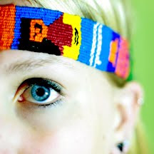
This is an obvious duotone photograph, where the superimposed color is an red-orange (specifically PANTONE 166 C) I rarely see duotones with this intense of a bright color...it seems more common to use extreme colors when they are cooler tones, like the example below.

So...yep that's blue (PANTONE 2915 C to be exact). Pretty extreme for a portrait, but it can be really dynamic for cold landscapes and the like. Now, for subtlety.
 Now this one also has a blue tone (PANTONE 544 C), but it is a lot more subtle. It just gives the image a cool feel, rather than screaming HEY LOOK I'M BLUE. Anyway...I like it. There are places where it can really enhance a photo in a quiet way.
This effect is perhaps my favorite. The superimposed color is a light beige/brown, called PANTONE 5835 C. It is a subtle warmth added to the photo. Not immediately noticeable or bothersome, but it adds a nice effect to the portrait.
You might think you see this all the time, with sepia and hue-adjusted photos, but it is a different effect. Hue adjustments change all the tones of the photo (shadows, midtones, highlights) to reflect that color. A duotone is a combination of two tones, that create a more natural effect. The highlights generally remain white, and the darkest shadows stay more or less black. Hue adjustments and sepia of course have their place in photography and digital manipulation, but I am a huge duotone advocate. It works within an image rather than overlaying an obvious effect on top of it.
So, if you're wondering how to do this:
1. Open an image in Photoshop
2. Change the color mode to grayscale, to make the Duotone option available (Image>Mode>Grayscale)
3. Change the color mode to duotone (Image>Mode>Duotone)
4. A box will pop up where you will choose your color
5. In the "Type" box, change the selection from Monotone to Duotone (Yes, there are other options there...you can do Tritone and Quadtone too!)
6. Click on the white box for Ink 2, and choose your color. (You can change your color options under the "Book" tab. I stick to PANTONE Solid Coated, because it is a common system used among professional printers)
7. Press OK, and you have yourself a fancy Duotone image! You can always go back and change your color in the .psd file, by getting back to the Duotone menu.
In the box that comes up after clicking on "Duotone," you'll see a small box next to your ink selections with a diagonal line through it. If you click on it, you can adjust the curve of a particular tone. If you know how to use the Curves adjustment, you might want to try this out. You can adjust specifically where you would like to see the most color (midtones, highlights, etc) with this feature. It gives you a lot more control over the use of color in your image.
Three cheers for duotone!! Hopefully I'll have some NEW images up soon that showcase this technique in all its glory.
No comments:
Post a Comment